If you use Twitter or Facebook, you may occasionally see status updates that look like: “I crushed a 7.2 mi run with a pace of 7’24” with Nike+ Running App. #nikeplus.” About a month ago I started collecting those tweets into a database, to see what interesting stats I could extract. Here are the results.
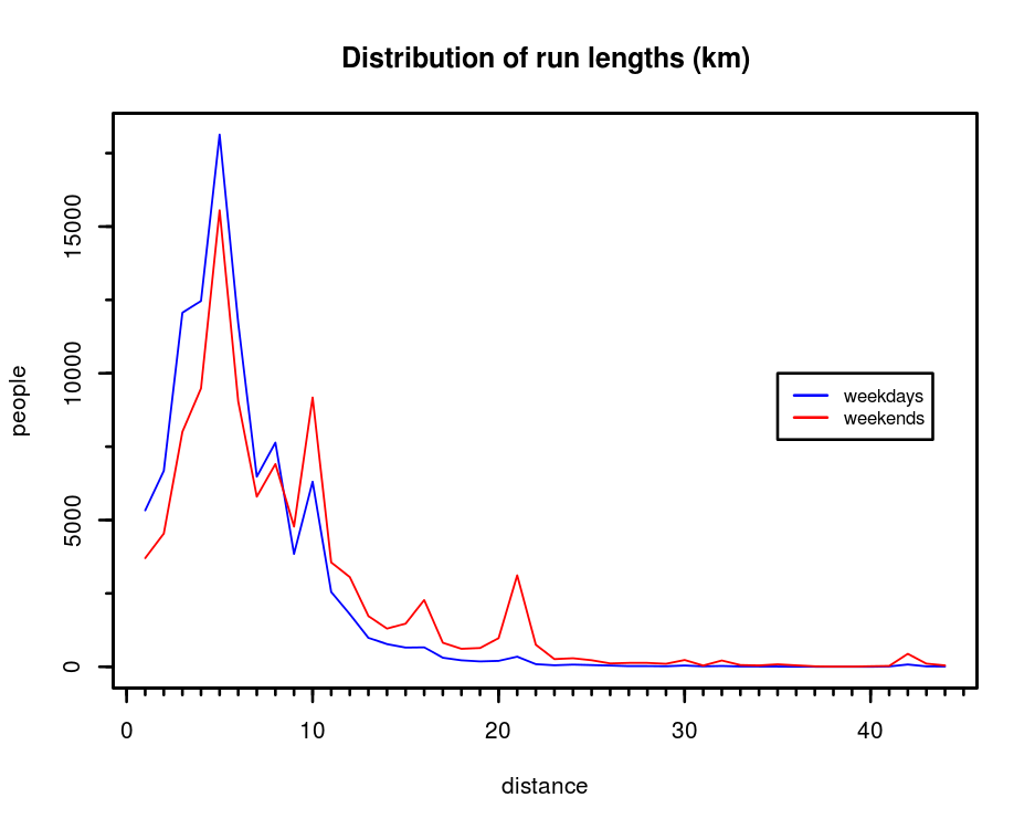
I collected about 300k tweets, of which about 85k had both the distance and the pace of the run. Some were in miles and some in kilometers, so I normalized everything to the metric system. I cleaned up some obvious errors or misuses of the system, e.g. people who “ran” at inhuman speeds such as 50 mph. Cheetahs :). I used the remaining data to plot a few charts. The first one is a histogram of distances people ran, split into weekdays and weekends:
A few insights from this chart:
- As expected, longer distances quickly become infrequent.
- People run longer on weekends. In fact, the average distance for a weekend run is 8.75 km compared with 6.47 km on weekdays.
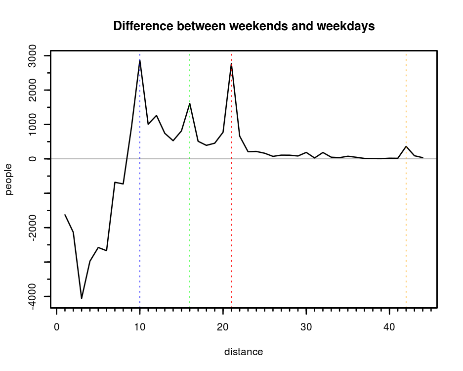
- Certain distances seem to be particularly popular during weekends, and they look like typical race lengths: 10k, 16k (10 miles), the half marathon and the marathon.
Here is a chart highlighting the difference between weekends and weekdays. For the comparison I normalized both datasets as if I had 100k runs of each, even though obviously I collected more weekday data than weekend.
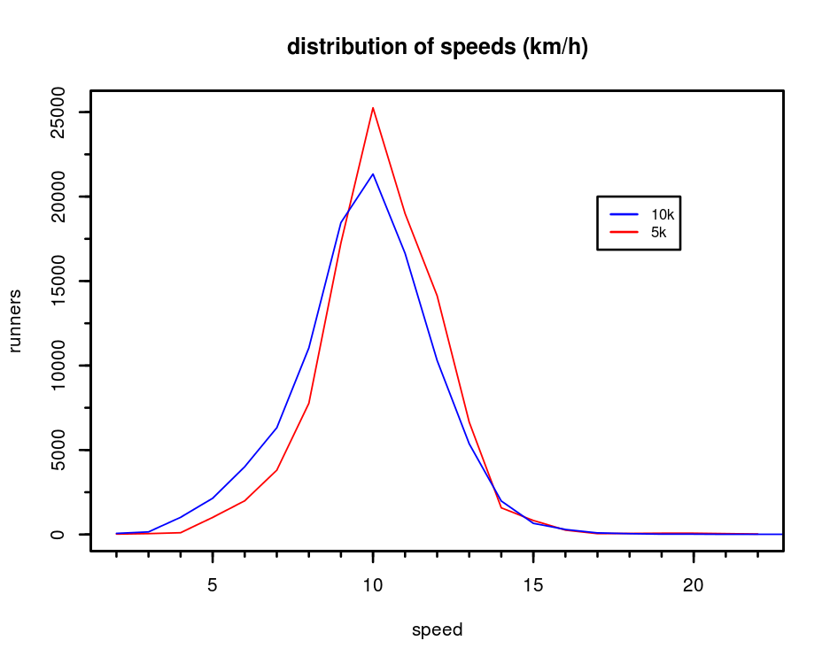
How about speeds? I tried to see if people run faster on weekends, it turns out that on average they don’t. I did expect the run length to make a difference in speeds, and it does. Here are the speeds for 5k and 10k runs, 5k runs are obviously a little faster on average.
The average speed for people who track their runs with #nikeplus seems to be around 10 or 11 km/h, which is a bit slower than I had guessed. Of course, I have no idea if this self-selected group of people who share their runs on the internet is representative of all runners. However, if you’ve ever run a popular race this curve will seem very familiar to you: the middle of the pack is always crowded, the elite athletes are few and spread out. Same for the slow runner / walkers who finish as the roads are being reopened to traffic.Can you think of more insights you would extract from the data? My code is on Github if you’d like to play with it.


Cool study. Should pull time of day distribution.
That’s a good idea. Unfortunately I don’t have reliable location information for most of the tweets, and it seems like Nike+ is popular in many different countries around the world. I’m still collecting tweets, so maybe I’ll give it a try later on.
Forgot about that… Standardized everything on nwzPaper to CST and will allow personalization later. All content comes with standardized location values complete with Lat/Lon. Have some fun projects planned down the road! Picking up useful variables in the journalist perspective too.
300k values over 30 days is ~10k daily average worldwide. I’d be curious what the event frequency is per week too. Looking at this data, 10k or even 30k regularly reporting accounts is not a market twitter can build much on.
Nike doesn’t need twitter, twitter needs Nike!
When I look at twitter all I see is an expensive-to maintain-chat system that has a big monetization problem and structural constraints to pivoting their format and business. These recent moves with their API are going to drive the developers away and finish them off. They will need an Asian Spring to raise more money in a couple of years…
Good job Diego!
Any demographic data? I’m not sure if you can find it, but it would be great to have genre, ages, and geolocation
It would be also cool to see how many of them stop using nikeplus after a certain time..